The Allocation Paradox Case Study: What Four Weeks of Real Office Data Revealed
WORKPLACE INTELLIGENCE · CASE STUDY
A single enterprise office. Four weeks of granular occupancy sensor data. The data exposed a structural contradiction hiding in plain sight: a building running at near-capacity crisis while simultaneously wasting a fifth of its space every single day.
|
4 weeks
Continuous data
March 30 – April 24, 2026
|
1,430
Workstations tracked
12 floors · 34 departments
|
~150
Unused desks found
Across the full week
|
$2M+
Value identified
Across 15 decision scenarios
|
What Was Measured
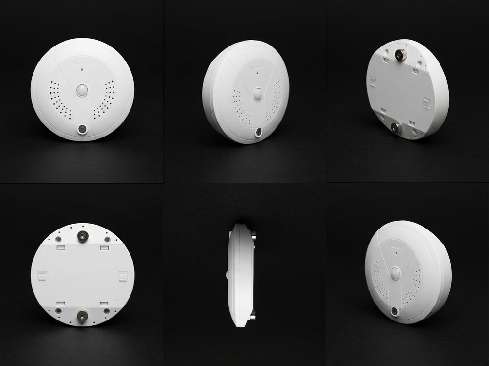
The dataset was extracted from ceiling sensors above workstations in a single office building: 12 floors, approximately 1,430 workstations, 34 neighborhoods. Each desk was instrumented to capture key metrics that together tell the true story of this building.
| Metric | What It Captures |
|---|---|
| Claim Rate | The proportion of full working days on which a desk was Claimed — meaning it registered at least one confirmed Valid Minute of occupancy. A day-level frequency metric: was this desk genuinely used today? |
| Minute Utilization | The proportion of total available working minutes in which the desk had confirmed active occupancy. An intensity metric: on days a desk was used, how much of the working day was it actually occupied? |
| Peak Concurrent Occupancy | The maximum number of desks simultaneously in use at any point during the week — the real capacity ceiling. |
| Never-Claimed Desks | Desks with zero sensor events across the entire week — completely invisible to any headcount or badge-entry system. |
The distinction between claim rate and minute utilization is where the entire analysis turns. Claim rate tells you how often a desk was touched — whether it was genuinely occupied on a given day. Minute utilization tells you how intensively it was used — what share of available working time had confirmed active occupancy. Both metrics reflect real occupancy; what they reveal together is the gap between being present and being at your desk.
Finding 1: The Allocation Paradox
Across all four weeks, building-level claim rate held steady between 67% and 71%. To most workplace managers, that number tells a comfortable story: two-thirds utilization, room to grow, no urgent action needed.
The department-level breakdown told a completely different story.
|
69%
Average claim rate
Appears comfortable
|
85%
Of departments running hot
≥85% of desks used at peak concurrent
|
31 of 34
Depts running hot on Week 16
Highest point across 4 weeks
|
The Lie of the Average
An average that looks healthy can mask an extreme distribution. In this building, a small number of floors and departments with very low utilization were pulling the average down — while the majority of teams were running at or past their functional capacity ceiling. The building was simultaneously over-crowded and under-used, on the same floors, often on the same days.
This is not a theoretical concern. Of the 34 departments tracked, between 27 and 31 were operating at or above 85% of their desk allocation during peak times in any given week. A department at 85% peak concurrent has essentially no buffer. One large meeting, one unexpected spike in attendance — and it tips into congestion.
The floors with low utilization are not underused by the same teams that are overcrowded. Space is allocated, not fluid. Department A on Floor 13 being at 40% claim rate does not help Department B on Floor 05 when it is at 94% — because in most enterprise office configurations, those spaces are not interchangeable.
With the neighbourhood allocation model the data makes visible: average utilization metrics are almost useless for space planning. What matters is the granular data — and in this building, the distribution was telling a crisis story that the average was hiding.
Finding 2: The Phantom Capacity Effect
The second major finding emerged from the relationship between claim rate and minute utilization. On average across all four weeks, desks were Claimed on approximately 69% of working days — meaning genuinely touched, with at least one confirmed sensor event. But minute utilization ran at only 33–35% of all available working minutes.
|
69%
Average claim rate
Days with confirmed occupancy
|
33%
Minute utilization
Share of minutes actively used
|
~48%
Intensity on claimed days
Active occupancy when in use
|
The arithmetic reveals the pattern: if a desk is Claimed on 69% of days but actively occupied for only 33% of total available minutes, then on claimed days it is occupied for roughly 48% of working hours (33% ÷ 69% ≈ 48%) — about 3.5–4 hours of an eight-hour day. The remaining half of those claimed days, the person is in meetings, at lunch, or collaborating elsewhere, and the desk is physically empty. This gap between claiming frequency and occupancy intensity is the Phantom Capacity Effect.
What ‘Phantom Capacity’ Means in Practice
With over a thousand desks, the intraday idle periods within claimed days create approximately 150–200 desk-slots at any given moment during peak hours that are physically empty but invisible to reservation systems. Because these desks are already Claimed for the day, standard dashboards show them as occupied — even when the person has been in a meeting room for the past ninety minutes. Colleagues scanning for available space cannot see what the sensor data makes clear: the desk is empty right now.

This has a direct knock-on effect on the departments that appear at-risk. Some portion of their apparent capacity crunch is phantom: desks that show as Claimed — and therefore occupied in any day-level system — but where the person has been away for extended periods. Colleagues hunting for space at 11am are not competing with 150 people actively working; they are competing with 150 desks whose owners stepped away hours ago.
The resolution is not more desks. It is smarter release logic — and the occupancy data provides exactly the signal needed to implement it. A desk that has been claimed but shows no utilization activity for 45–60 minutes can be automatically returned to available inventory, recovering 150–200 productive desk-slots daily without any physical change to the floor.
Auto-release logic is among the highest-ROI interventions available in a building with such working patterns. This is fully actionable from the existing data stream. It requires no hardware, no construction, and no change to headcount allocations.
Finding 3: What the Data Makes Possible
The value of this analysis is not in the findings themselves. It is in the decisions they make possible — decisions that can now be made in confidence. Below are four concrete interventions that flow directly from the four-week dataset, along with their estimated value.
1. Auto-Release: Recover Capacity Without Adding Desks
The 2:1 claim-to-use ratio provides a clean signal for intelligent auto-release potential. Desks with no active utilization after 45–60 minutes of a claim event are eligible to be returned to available inventory. Estimated recovery: 150–200 desk-slots per day. For teams currently operating at 90%+ of their functional ceiling, this is immediately felt as breathing room.
2. Targeted Floor Deactivation on Fridays
Friday average concurrent occupancy ran at 61–65% below weekday peak across all four weeks. Floor-level data identifies 2–3 specific floors that reach fewer than 40 concurrent occupants on Fridays consistently. Consolidating Friday attendance to active floors and deactivating HVAC, lighting, and access control on dormant floors yields an estimated 109,000–166,000 kWh per year in energy savings — with no impact on employee experience.
3. The Floor 23 Consolidation Opportunity
One floor in the building ran at 32–45% claim rate across all four weeks — consistently below the Healthy utilization tier. A consolidation scenario in which that floor’s teams are redistributed to underutilised adjacent space, and the floor is either sublet, surrendered, or repurposed, carries an estimated annual value of $350,000–$500,000. This decision cannot be made from headcount data alone; it requires knowing how many are actually using the space.
4. Evidence-Based Attendance Policy Design
The day-of-week breakdown shows a consistent M–W attendance spike followed by Th–F decline. Peak concurrent occupancy on peak days (Tue/Wed) runs 28–35% higher than on Thursday and Friday. An attendance policy that shapes this curve — incentivising Thursday presence and redistributing peak-day density — can eliminate the capacity crunch for at-risk departments without reducing aggregate attendance or adding a single desk. This can be the difference between a policy built on instinct and one built on data.
Combined Value Across Scenarios
The four decisions above, taken together, represent an estimated $2M–$5M+ in identified savings value across lease optimisation, energy savings, and operational efficiency — and more importantly improve employee satisfaction with the building and its allocated spaces. This is before considering the expected compounding value of decisions made continuously over months and years as the data layer persists and the baseline deepens.

The Deeper Lesson
The Allocation Paradox is not unique to this building. It is a structural feature of how enterprise offices are managed: space is allocated once and reviewed rarely, while actual usage patterns shift continuously. The result is a slow drift toward dysfunction that only becomes visible when it tips into crisis.
What this four-week dataset demonstrates is that the drift is detectable long before the crisis. The signals are there — in the gap between claim rate and utilisation, in the department-level pressure distribution, in the intraday patterns that reveal when and how space is actually being used. They are simply not visible to the tools most organisations rely on.
The central insight
The question is no longer whether an office is occupied. It is how it is occupied, the granular distribution, and what decisions data enables. The organisations that answer that question continuously — not annually, not from surveys, not from badge swipes — will be the ones that make better real estate decisions, reduce operational waste, and give their people a workplace that works.
About This Analysis
This case study is based on four weeks of real sensor-derived occupancy data from a single enterprise office building. All identifying information has been removed: the building name, tenant name, department names, and city have been anonymised. Metrics, findings, and value estimates are derived directly from the minute-by-minute occupancy dataset provided by the PointGrab sensors.
The custom analysis was produced using the PointGrab Workplace Intelligence Agent, which maps sensor data across four decision levels: Tactical, Strategic, Structural, and Predictive.
For more examples of insights and use cases which rely on our data, contact PointGrab.
Frequently Asked Questions
What is the Allocation Paradox in office space management?
The Allocation Paradox describes a situation where a building’s average utilization appears healthy — often 65–75% — while simultaneously having some departments severely over-capacity and others chronically underused. Because space is allocated rigidly by department rather than shared dynamically, the surplus in one area cannot relieve the pressure in another. The result is a building that is both crowded and wasteful at the same time.
What is the Phantom Capacity Effect?
The Phantom Capacity Effect occurs when desks are claimed for the day by an employee who then spends most of their time in meetings, collaboration areas, or away from their workstation. Standard reservation and access-control systems count these desks as occupied, but sensor data shows them physically empty for hours. This creates a pool of 150–200 desks at any given moment that appear taken but are actually available — invisible capacity that worsens the perceived shortage for teams hunting for space.
What is the difference between claim rate and minute utilization?
Claim rate measures how often a desk was used across working days — it answers “was this desk touched today?” Minute utilization measures what proportion of total available working minutes the desk had confirmed active occupancy. A desk can have a high claim rate (used most days) but low minute utilization (owner frequently away from it). The gap between the two metrics is precisely where actionable insights — like auto-release logic — are found.
How much capacity can auto-release logic recover in a large office?
In a building of approximately 1,430 workstations with a 2:1 claim-to-use ratio, implementing auto-release logic — returning claimed but idle desks to available inventory after 45–60 minutes of inactivity — can recover an estimated 150–200 productive desk-slots per day. This requires no new hardware, no construction, and no change to headcount allocations. It is entirely driven by the existing real-time sensor data stream.
What financial value can a floor consolidation deliver based on occupancy data?
In this four-week analysis, one floor consistently operated at 32–45% claim rate — significantly below the Healthy utilization tier. A consolidation scenario in which that floor’s teams are redistributed to underutilised adjacent space and the floor is sublet, surrendered, or repurposed carries an estimated annual value of $350,000–$500,000. This type of decision requires granular, sensor-derived occupancy data; headcount or badge-swipe data alone cannot distinguish genuine non-use from hybrid attendance patterns.
Related Articles
- The ROI of Occupancy Sensors: Building the Business Case for Workplace Intelligence
- The Workplace Data Problem: Why Your Office Needs a Spatial Data Layer
- Data-Driven Workplace Design: Using Occupancy Intelligence to Create Spaces People Love
- Desk Occupancy Sensors: The Case for Workstation Monitoring in Hybrid Offices